Yellow is Not a Primary Color

Updated: Mar 23
Color Theory Series Note
This post is the first in a series of posts on color theory, and color management. I believe that color science is foundational for photography, videography, and other art forms as well. It has informed the ways in which I process images, as well as how I evaluate a scene for composition. But just as important, this is just fascinating stuff! That includes it's history. Pretty much whole foundation of modern color theory was formalized by 1931 CIE color standards. Think about that. In the 1920s, color scientists were able produce monochromatic light across a broad range of wavelengths, and then measure the human perception of color. There are certainly lots of questions: How did they do it? Why are only three primaries sufficient to reproduce (nearly) the full gamut of humanly perceptible colors? What's special about humans - do other animals see color differently? How does neural science of our visual system explain the perception of color? What is the current state of our color technologies? How can a deeper understanding of color theory inform, and improve, our photography? Those are the questions I intend to address in this series. So, let's get to it?
What are the schools teaching our kids?
I was talking to my granddaughter while waiting for the school bus one day. She is in the second grade. I asked her what she was learning in school, and if she had learned about colors. She said yes. I asked her what the primary colors are, and she replied red, green and yellow.
The schools have been teaching that since I was her age, and that was well into the last century. The primary colors are red, green, and blue. People argue with me about this. They are wrong. I've heard 'well red, green, and yellow are my primary colors.' Nope, I'm not buying that. What are primary colors, and what makes them special? There is a rigorous, and extremely practical, definition. One does not simply get to have their own special definition.
Color is not a property of light. Color is a perception.
Light has two properties: intensity and wavelength. The latter is usually associated with color, but the relationship is not simple. Light is a stream of photons, and each having a wavelength. The intensity of a beam of light the photon flux - the rate at photons pass through a surface per unit of surface area. When all the photons in a beam of light have the same wavelength, it is said to be monochromatic light, and each wavelength defines a color. These are the colors of the rainbow. And what are those? Well, as we were taught in grade school using the acronym Roy G. Biv, they are red, orange, yellow, green, blue, indigo, and violet. This is also wrong. Indigo and violate are not rainbow colors, but cyan is, and blue is out of order.

Sir Issac Newton demonstrated that white light can be split into its composite colors by passing it through a prism. It was Newton who gave us the Roy G. Biv description of the color spectrum. Newton, however, lived in the 17th century. The English language has changed since then, and that includes the names we give to some colors. What was called blue in Newton's day is what we call cyan today, and what he called indigo is called blue today. Cyan is a monochromatic color, and it is not just a "light blue." The correct sequence of monochromatic colors, from longest wavelength to shortest, is
red, yellow, green, cyan, and blue.
Of course, the rainbow is a continuum colors that blend into each other, and this list is missing some popular intermediates. For example, I didn't list orange, which is between red and yellow. This list contains the primary colors, and two secondary colors that lie halfway between the primaries. We could keep subdividing indefinitely. But the primary and secondary colors are specials, so we are concentrate on them here.
Some colors can be realized as combinations of other colors. Yellow, can be realized as a beam of monochromatic light. However, there are combinations or mixtures of red and green photons that is indistinguishable by human perception from a beam of monochromatic yellow light. The technical term for different color combinations that produce the result to human is metamerism. Color is not a property of light. Color is a perception, created by the neural structure of the retinas of our eyes, and a massive amount image processing performed in our brains.
Notice that the primary and secondary colors are not evenly distributed across the color spectrum. Looking at the picture above, you have to squint to see the fine line of cyan between green and blue. The prism separates light by wavelength, not color, which is a human perception. A prism, which is a hunk of glass, has no perception. We give these color equal importance or weight is due of our perception, not their relative width in the wavelength spectrum.
Updating Newton
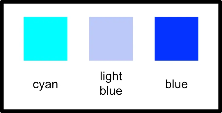
The swatches below compare saturated cyan and blue, and a "light blue." Light blue is a tint, which is a combination of a saturated color and white. This blue tint that has the same lightness (specifically, the L*-lightness to be covered later in another posts) as the saturated cyan. Clearly, cyan is a different color than blue. Would you call the cyan swatch "blue," and the blue swatch "indigo"? In the 17th century, you may have.
What about violate? A search using the Pantone color finder, which has over 2,000 named colors, yielded a few colors with violate their name. One is "rose violate," which is a roughly a 50-50 blend of red and blue, plus a smidge of green. Magenta is a combination of red and blue, and there is no single wavelength that produces a monochromatic magenta light. So, violate is just a shade (that is, a darker tone) of magenta, and, thus, it is distinctly is not a rainbow color.
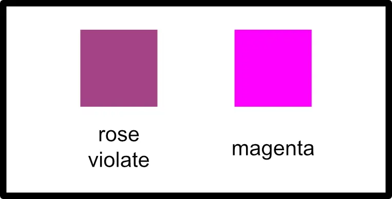
That's enough Newton bashing. After all, color science that we know today was developed mostly in the 19th and 20th centuries, and Newton didn't have the powerful digital tools that I used to create these swatch images.
By the way, you may not think of cyan as a common color, or you may not have identified the color swatch in the first figure as cyan. A Pantone Color Finder search for cyan only produced one color, "cyan blue," with cyan in its name. However, we find a lot of common color words in shades, tints and near-by hues, such as "teal," "aqua," "ocean", "turquoise," and, yes, forgive me Sir Issac, "cyan blue" is a shade of cyan, not blue.
The Other Secondary Color: Magenta
Monochromatic light consists of photons of a single discrete wavelength. We may say that yellow is a "monochromatic color," but that only means that yellow is a color that can be produced by a monochromatic light. We can also have a beam of yellow light that is a metamerism (mixture) of red and green. This begs two questions: Are there any saturated colors that only exist as a metamerism of other colors? What is a saturated color? I'll have to leave the latter question to a future post.
Magenta light is only produced as a 50-50 combination of red and blue light, so it is a secondary color, but it cannot be perceived from a monochromatic light beam.
What is a primary color?
I offer you not one, but two definitions.
Physical Definition: A primary color is a monochromatic color that has no metamerism. It can only be produced by monochromatic light.
Functional Definition: A system of primary colors is a finite set of colors from which nearly the whole gamut of humanly perceivable colors can be produced as combinations of just that set.
The truth is that the purely physical definition yields an infinite set of "primary colors." That's not very practical. Our modern color technologies, including TV and computer screens, and digital image sensors, are, in large part, possible because only because we can satisfy the functional definition with a small set of primary colors. How would that work if we needed, say, thousands primaries.
Don't laugh. We have another sense where that is exactly the case. A pure tone is the audio analog of monochromatic light, as both are determined by a single discrete wavelength. The fundamental physical properties are intensity and wavelength for both light and sound. But our sense of sound has no analog for metamerisms of light. Combinations of pure tones produce harmonics and chords, and we can't reproduce chords using different combinations of pure tones. (I told you this stuff is fascinating!)
The Negative Side of the Story
Some readers have been yelling at me about other "primary" color systems; specifically cyan/magenta/yellow or CMY. So there! Yellow is a primary color after all. In a certain sense yes, but yellow does not belong with red and green any functional primary system.
I've been talking about color perception as combinations of light, which is what our eyes and brain do. That's called additive color. CMY is a pigment color system, for paints, dyes, inks, crayons, etc. Those systems produce color, additive color for our eyes, by reflection when illuminated with white light. Pigments absorb or reflect, to varying degrees, depending on wavelengths. For wavelengths they reflect, they are transmitting the those components of the incident white light. Where they absorb, they are removing, or subtracting, those components of the incident white light. We see the reflected light. When we talk about pigment color, and combinations thereof, we are talking about subtractive color.
For additive color technologies (screens and image sensors), we use additive primaries. Therefore, for subtractive color technologies (paints, inks, ...), we should subtract the additive primaries from white. Since white = red + green + blue,
subtract red = white - red = green + blue = cyan subtract green = white - green = red + blue = magenta subtract blue = white - blue = red + green = yellow
If you insist on calling yellow a primary color, then you do that only in the context of a CMY, or larger, color system. Then, you are required to say that cyan/magenta/yellow are subtractive primaries as opposed the additive red/green/blue primaries. Nope - not for me. When I say primary, without a qualifying adjective, I mean additive primary, because that's the way our brains work. Why do you (meaning the "hypothetical you" that still thinks yellow is a primary color, not my dear reader who got this far) insist on being so negative?
Finally, our modern light radiating technologies color reproduction systems do an excellent job reproducing nearly the entire color gamut of human perception. CMY based systems, mixing paints or dyes, don't do anywhere near as well. To be fair, pigment color science and technology is a harder problem than light emitting technologies. This is due to the fact that the reflected light metamerism (the light intensity vs. wavelength spectrum) depends on the spectrum of the incident white light as well as the pigment that reflects. (I'll address that in a future post on the importance of quality gallery lighting.)
Mixing CMY primaries should produce black. But when you mix CMY inks, dyes, or paints, you get a muddy brown. This is just a practical limitation of pigment technology. The practical solution to the deficiency of CMY is to increase the number of "primaries." Standard quality color printing is usually CMYK where the K stands for black. (B was taken by blue.) That results in better rendering of the darker shades. High quality color printers use even more primaries. My fine art photographic printer has ten primary colors: cyan, magenta, vivid magenta, blue, light blue, red, black, grey, light grey, and matte black. It makes beautiful prints.
Comments